Parcel Perform Design System

Established the design system for an enterprise software with over 600 monthly active users across 80 International Brands such as Decathlon, Nespresso and Wayfair. 

I led the product design for Product Rebrand and Design System.

Background

Prior to joining the team, the design team has some of the UI components copied from Sketch to Figma. Basic styles such as fonts, colors and components were undefined and inconsistent. This directly adds to the complexities and implementation workload for future deliverables. Hence an overhaul of restructuring and proper organization is required.

The problem

Internal scalability and efficiency

As the product team iterates on the product offerings, components and patterns were changed from one iteration to another resulting in inconsistency and misalignment. The lack of proper processes and design system resulted in poor product quality, UX and inefficiency in shipping new products.

The Goal

Overarching vision of the rebrand
Parcel Perform is the leading logistics platform for global companies. With increasing user adoption  internationally, Parcel Perform aims to expand its branding and appear modern and global to accomodate its digital presence.
Help developers and designers to work easier
The design system should help to save designers and developer’s time. The design team can then focus on delivering better UX instead of recreating product UI repeatedly.
The design system also aims to improve the structure and efficiency for front-end implementation.

The Plan

  • Audit and see discrepancies across fonts, colors, and components
  • Document the variations of interactions & states of each component (Default, hover, disabled)
  • Getting support from developers, getting designers onboard
  • Getting buy-in from stakeholders
  • Propose new visual design direction to align with the rebrand and to make the product feel contemporary and international

Team

  • Product Designer (Myself)
  • Product Manager
  • Front End Team

Timeframe

  • 4 months and continuous

Design Core Competencies

  • Design System
  • Visual, UI, Interaction Design
  • Understanding of development and code

The process

Colors

Before: Colors were not defined. There were 200+ variations of blues used across the product.
After: I set up a color library which documents the purpose of use across different situations.
Before vs After
Establishing primary palettes and system colors with specific documentation on its purposes.
Design System View

Fonts

Before: Fonts were undefined and inconsistent.
After: Fonts are now tied to specific purposes with structure.
Before vs After
Establishing type system with specific documentation on its purposes.
Design System View

Challenges faced during the process

The design system’s scope is limited to a visual rebrand, without a case-by-case solution to all existing the usability issues.

So what I did was to explore how I can address some of these usability issues faced by the customers visually which is within the scope.

For example, from our research, 60% of users did not know that they could create their own report. This was because the Create Report CTA button was styled in blue, like the rest of the components in the product. It was not apparent enough.

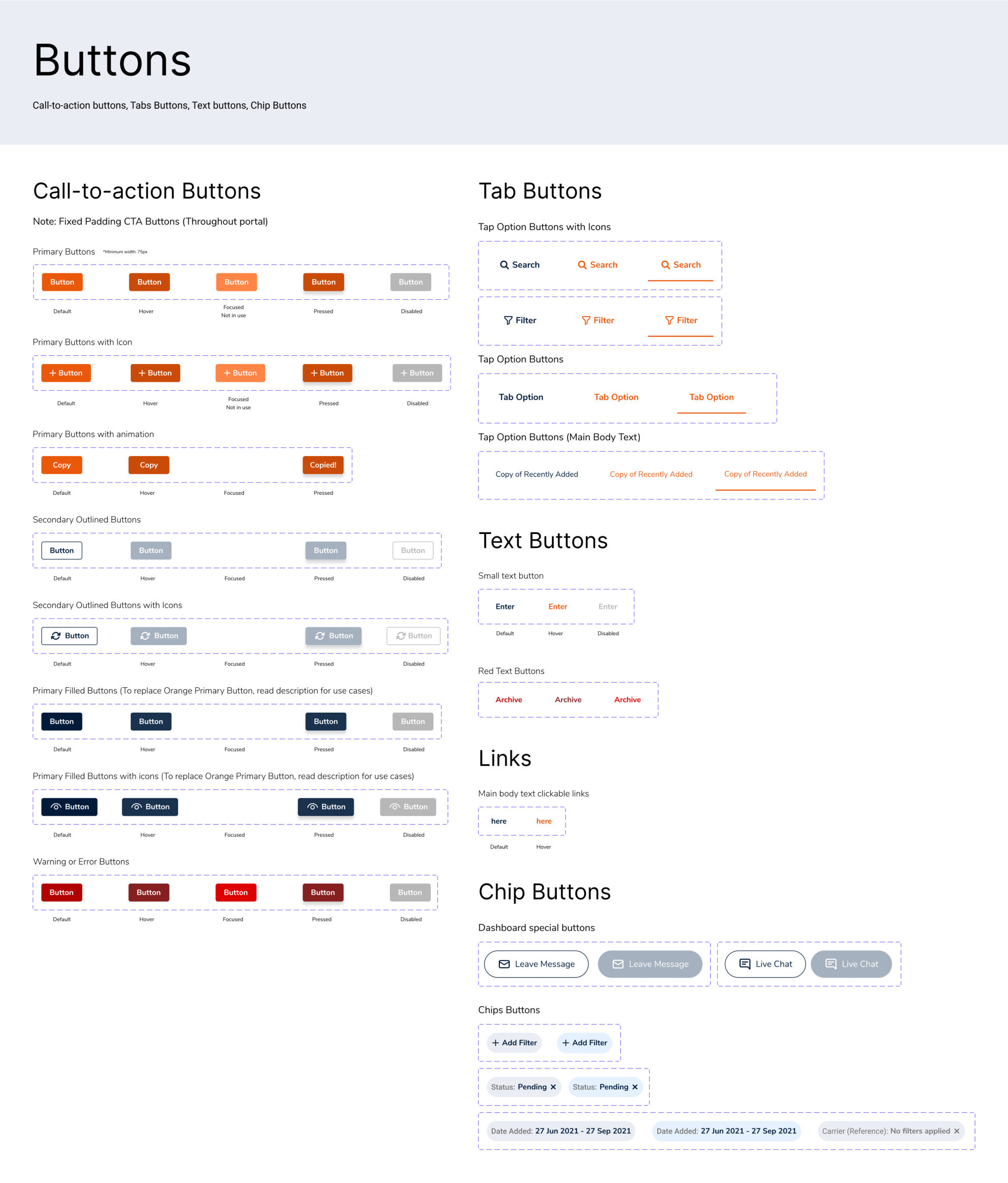
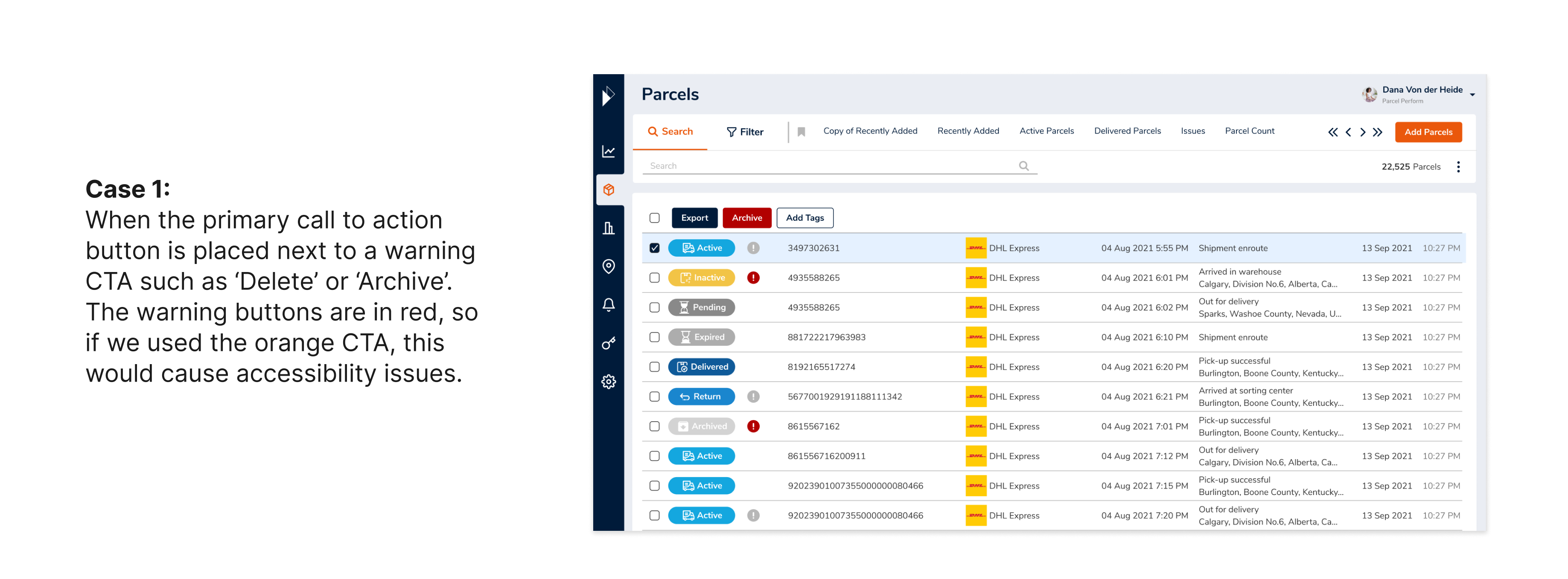
Design solution: Introducing orange to the color palette. Orange used with the intention to indicate an active state or Call-to-action buttons for users.
Before vs After

Design System

Before and After the Product Rebrand

Video Prototype

Rebrand Launch! Collaborating with Marketing

Worked with Niveditha and Linh on several marketing collaterals and landing pages.

Conclusion

1. Problems Faced

2. Trade-offs

3. Results

4. Next steps